Werk
About
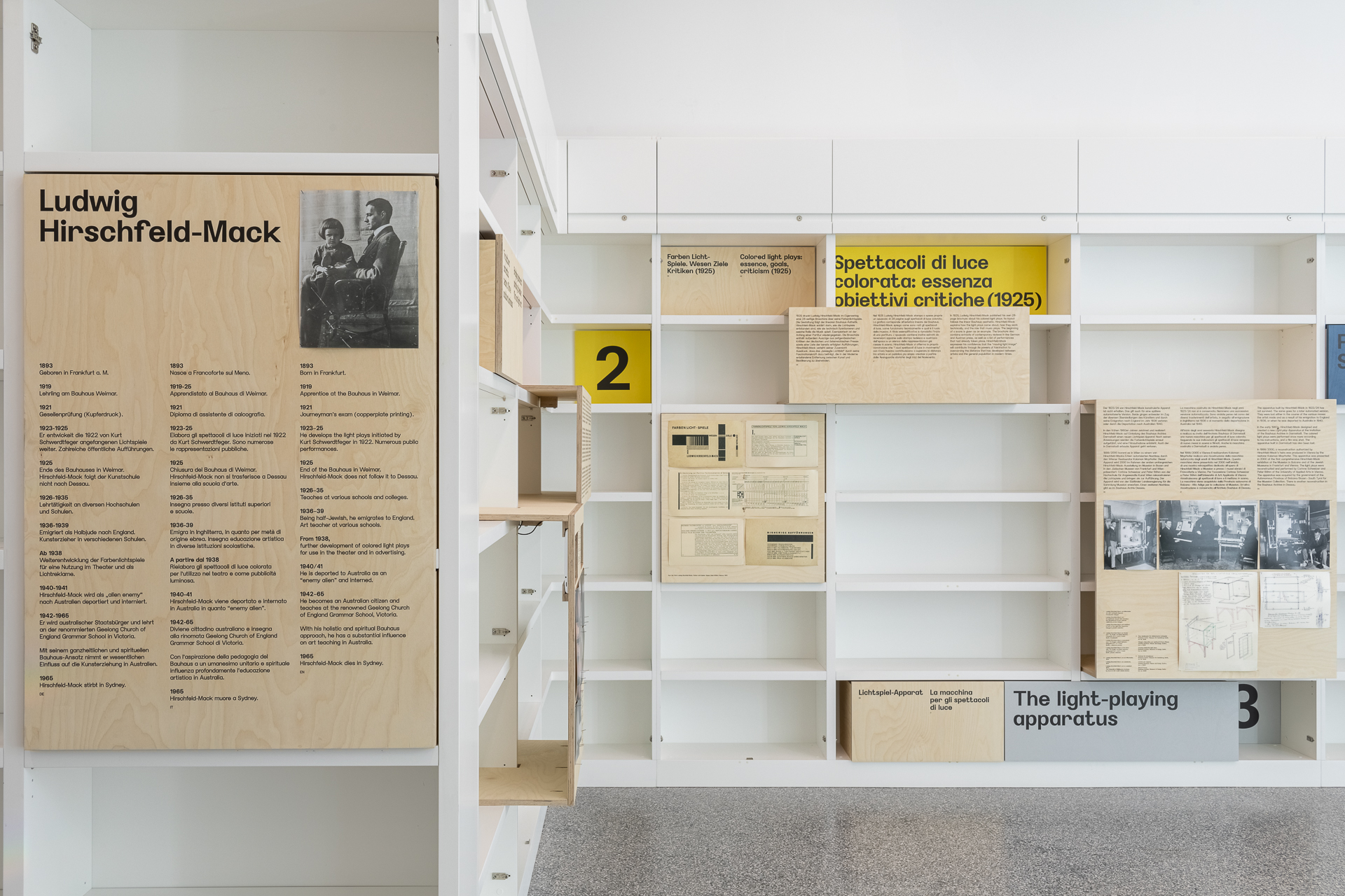
Some things don't need to shout to be good. Werk has its roots in the geometric sans serifs of the 1920s and 30s and the quiet precision of mid-century architecture journals. We liked the way those worlds used proportion and space to make things feel considered without making them feel precious. Werk follows the same idea. Its letters are geometric but never completely mechanical. Small details keep them human. It can hold a title together or sit quietly across an entire publication. Werk doesn't need to be the most interesting thing on the page. Sometimes its job is to make everything around it look better.
CATEGORY
Sans Serif
DESIGNED BY
trulytype
RELEASE DATE
2015
VERSION
1.0.1
STYLES
4 styles
ITALICS
None
FILE FORMAT
OTF, WOFF2
LANGUAGE SUPPORT
English, Spanish, French, Portuguese, Indonesian, Swahili, Malay, Italian, Polish, Romanian, Croatian, Hungarian, Czech, Slovak, Swedish, Norwegian Bokmål, Norwegian Nynorsk, Danish, Finnish, Icelandic, Catalan, Galician, Basque, Irish, Welsh, Scottish Gaelic, Slovenian, Bosnian, Estonian, Latvian, Lithuanian, Albanian, Maltese, Afrikaans, Somali, Wolof, Northern Sotho, Southern Sotho, Luo, Filipino, Javanese, Cebuano, Sundanese, Kurdish, Turkmen, Maori, Kalaallisut, Faroese, North Sámi, Luxembourgish, Walloon, Romansh, Sardinian, Corsican, Friulian, Occitan, Upper Sorbian, Lower Sorbian, Cornish, Manx, Kabuverdianu, Jola-Fonyi, Ido, Interlingua, Lojban
— Typography Standard®
View technical report
83%
Legible
96%
Glyph coverage
87%
Readability
71%
Distinct glyphs
100%
Technical integrity
94%
Layout
92%
Files
100%
Licensing
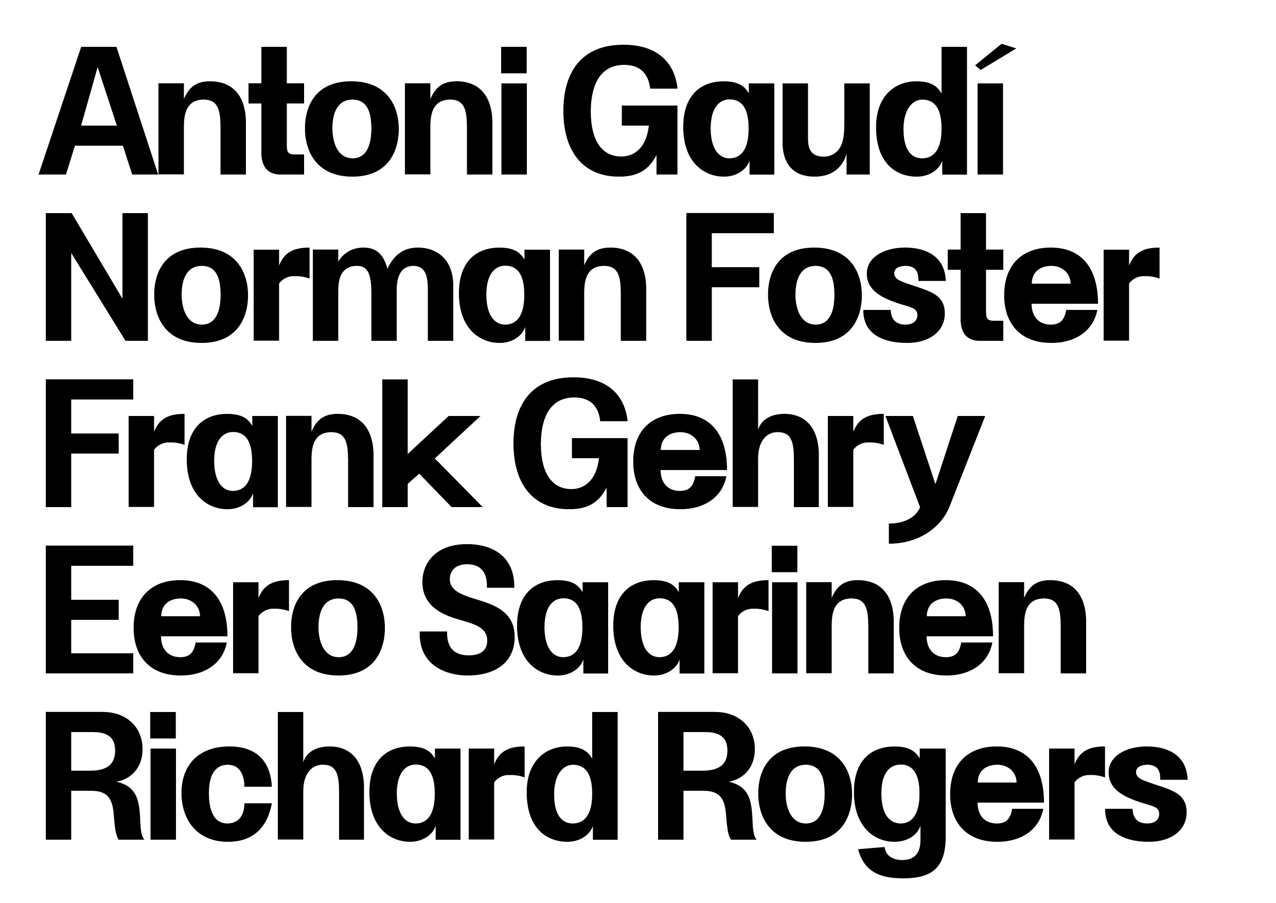
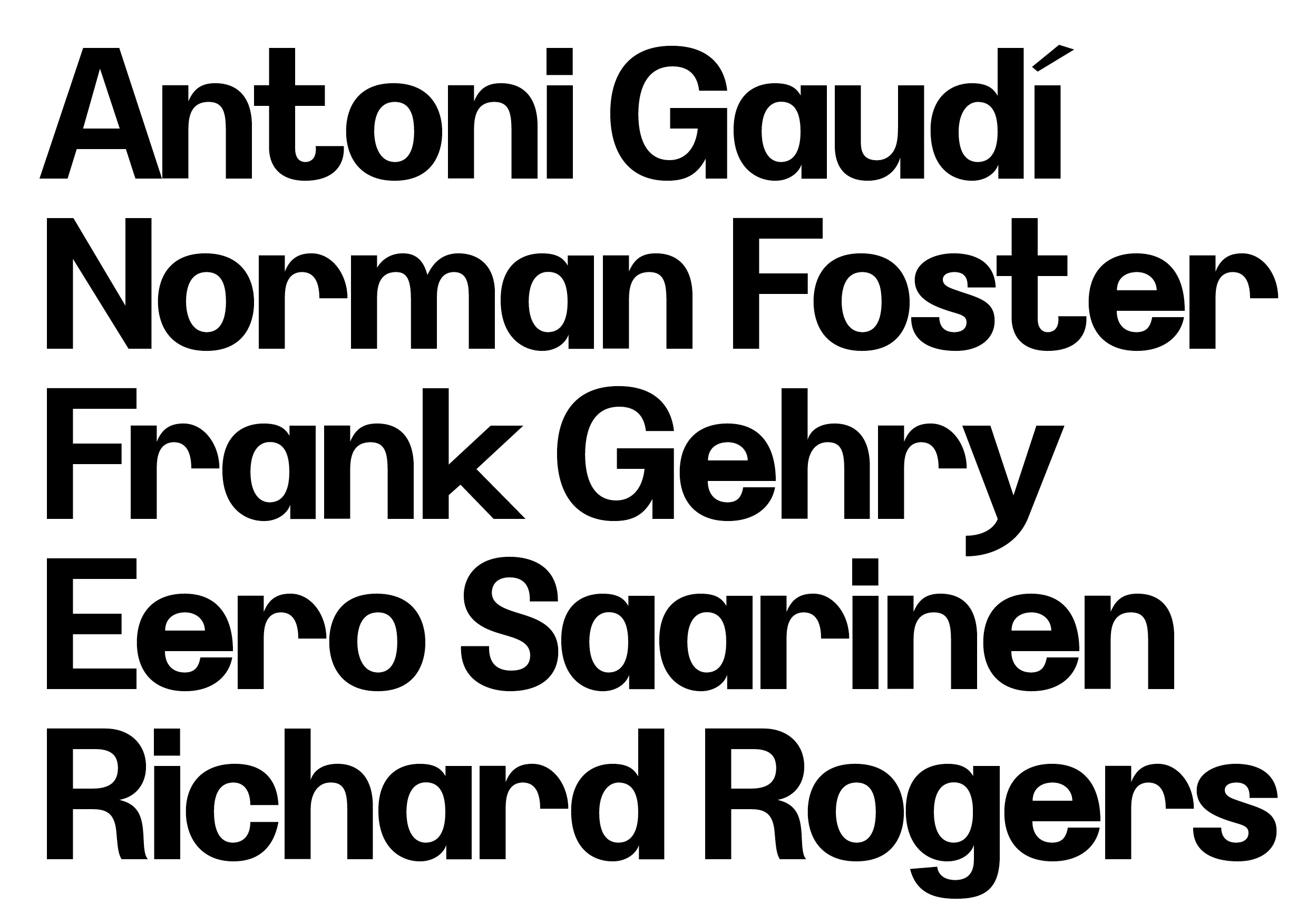
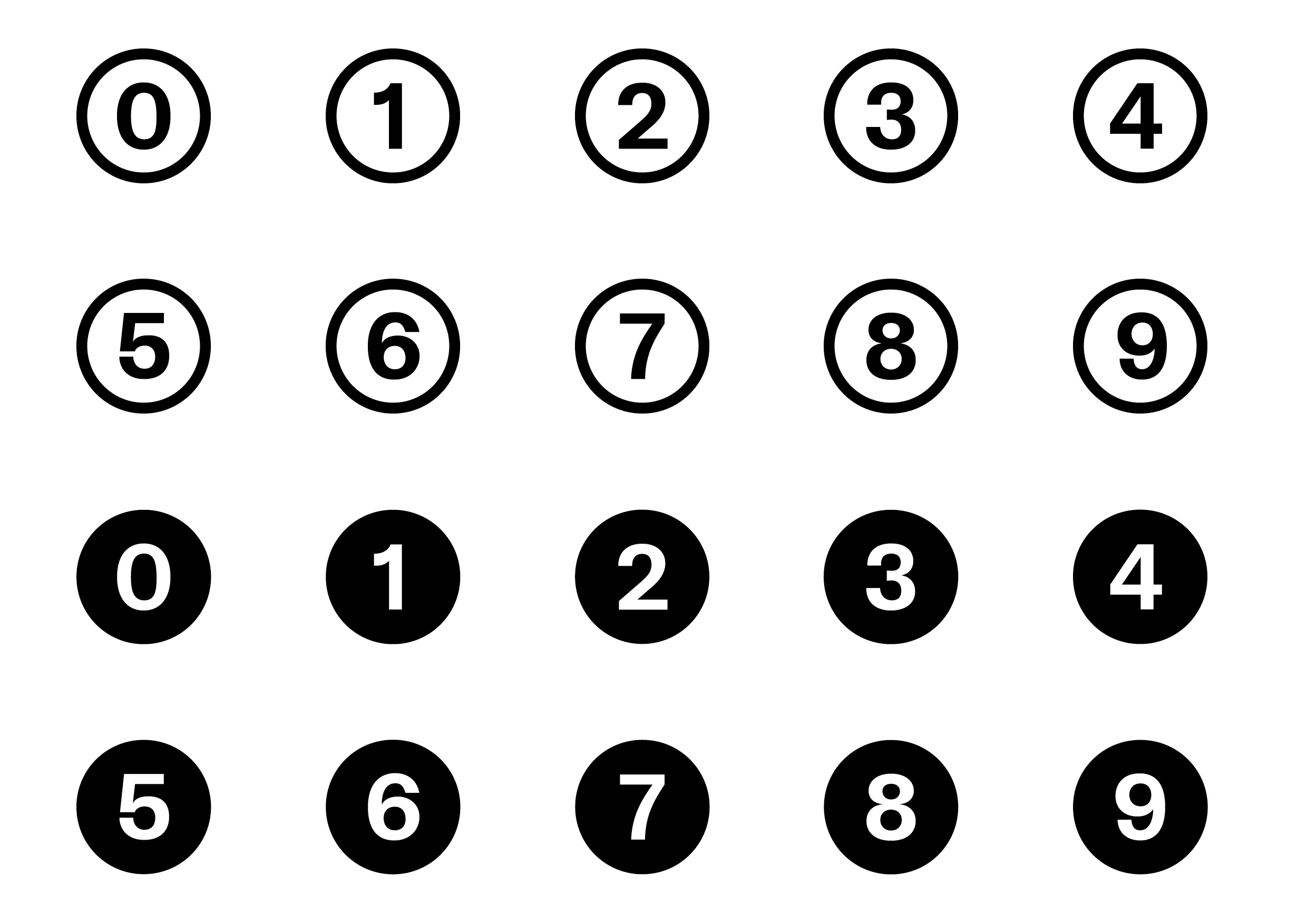
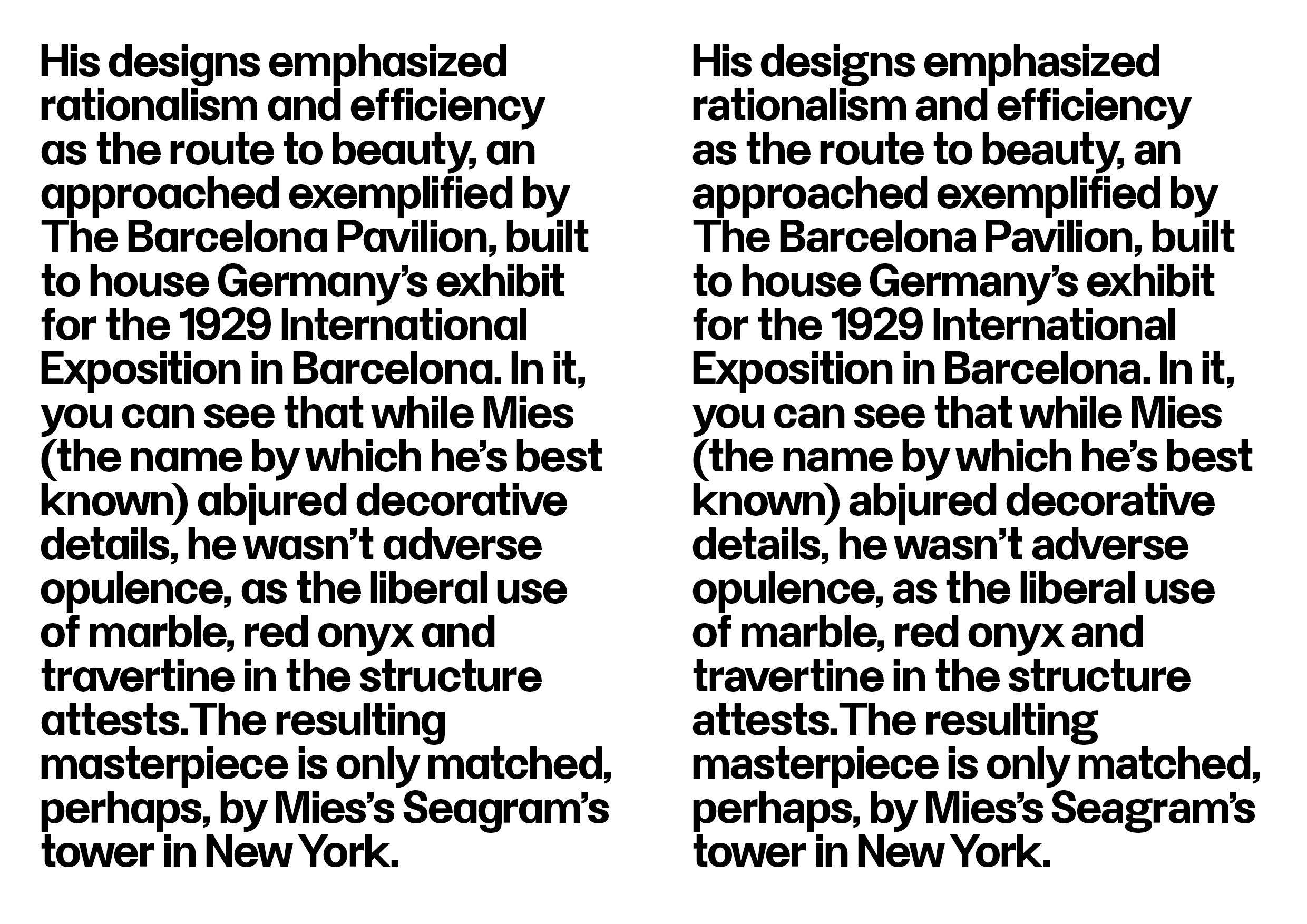
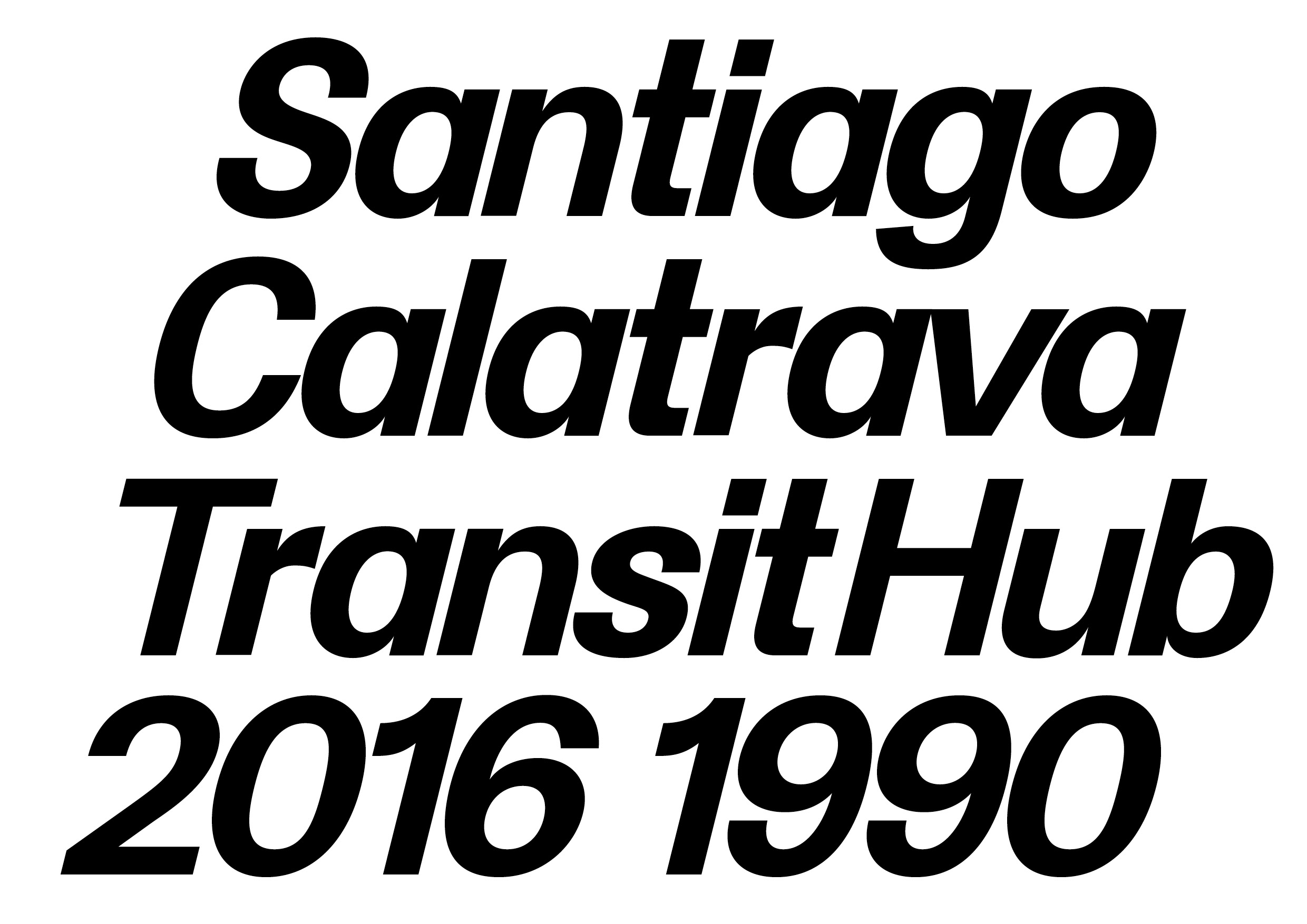

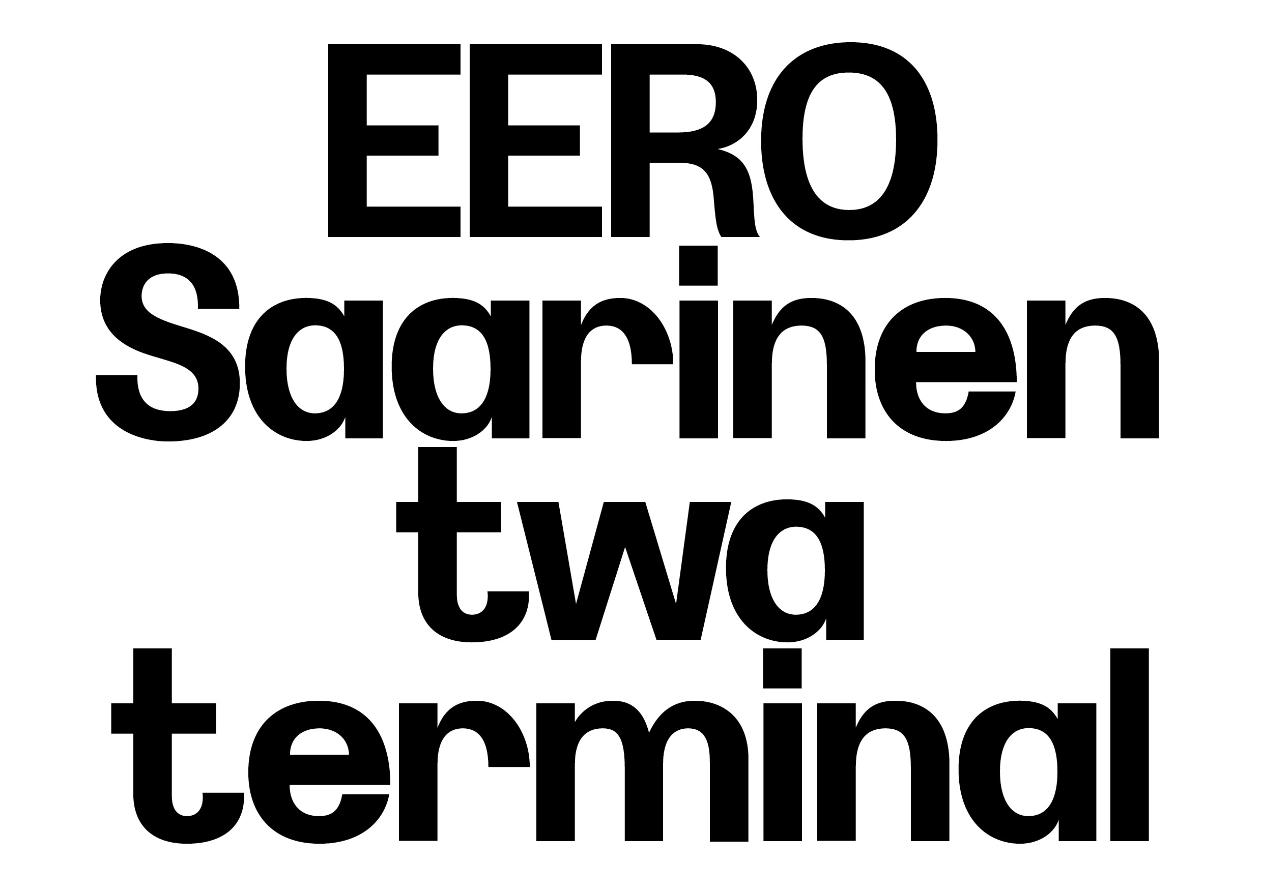
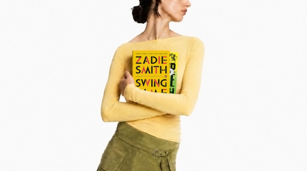
Werk in the world
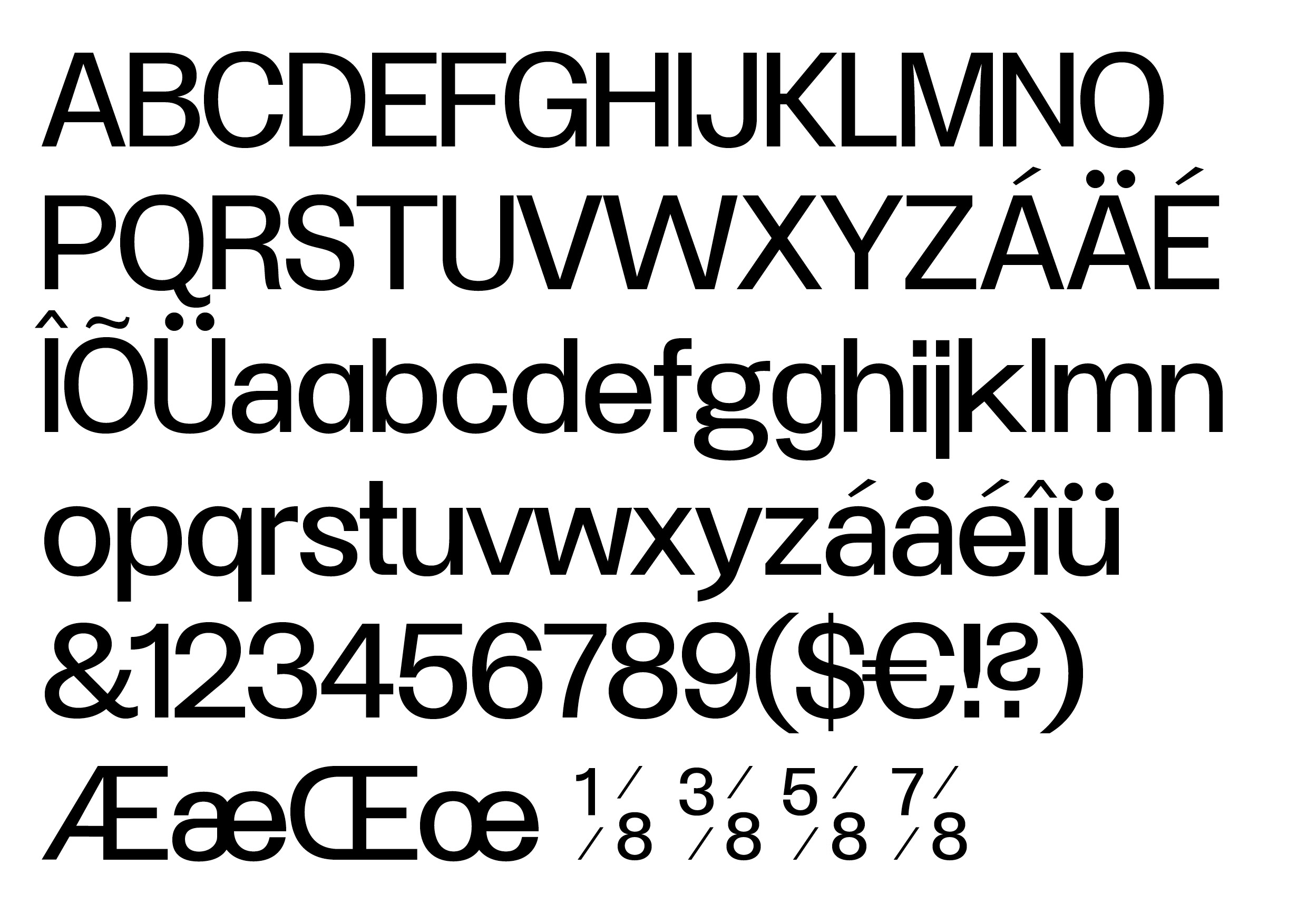
Available Glyphs
Uppercase
A
B
C
D
E
F
G
H
I
J
K
L
M
N
O
P
Q
R
S
T
U
V
W
X
Y
Z
Lowercase
a
b
c
d
e
f
g
h
i
j
k
l
m
n
o
p
q
r
s
t
u
v
w
x
y
z
Numerals
0
1
2
3
4
5
6
7
8
9
Latin Extension
À
Á
Â
Ã
Ä
Å
Æ
Ç
È
É
Ê
Ë
Ì
Í
Î
Ï
Ð
Ñ
Ò
Ó
Ô
Õ
Ö
Ø
Ù
Ú
Û
Ü
Ý
Þ
à
á
â
ã
ä
å
æ
ç
è
é
ê
ë
ì
í
î
ï
ð
ñ
ò
ó
ô
õ
ö
ø
ù
ú
û
ü
ý
þ
ÿ
Ā
ā
Ă
ă
Ą
ą
Ć
ć
Ċ
ċ
Č
č
Ď
ď
Đ
đ
Ē
ē
Ė
ė
Ę
ę
Ě
ě
Ğ
ğ
Ġ
ġ
Ģ
ģ
Ħ
ħ
Ī
ī
Į
į
İ
ı
Ķ
ķ
Ĺ
ĺ
Ļ
ļ
Ľ
ľ
Ł
ł
Ń
ń
Ņ
ņ
Ň
ň
Ŋ
ŋ
Ō
ō
Ő
ő
Œ
œ
Ŕ
ŕ
Ŗ
ŗ
Ř
ř
Ś
ś
Ş
ş
Š
š
Ţ
ţ
Ť
ť
Ŧ
ŧ
Ū
ū
Ů
ů
Ű
ű
Ų
ų
Ŵ
ŵ
Ŷ
ŷ
Ÿ
Ź
ź
Ż
ż
Ž
ž
Ș
ș
Ț
ț
Ẁ
ẁ
Ẃ
ẃ
Ẅ
ẅ
Ỳ
ỳ
Punctuation & Symbols
!
"
#
$
%
&
'
(
)
*
+
,
-
.
/
:
;
<
=
>
?
@
[
]
_
`
{
|
}
~
¡
¢
£
¤
¥
¦
¨
©
«
¬
®
¯
°
±
´

·
¸
»
¿
×
÷
ˆ
ˇ
˘
˙
˚
˛
˜
˝
–
—
‘
’
‚
“
”
„
•
…
‰
‹
›
™
−