Grotex
About
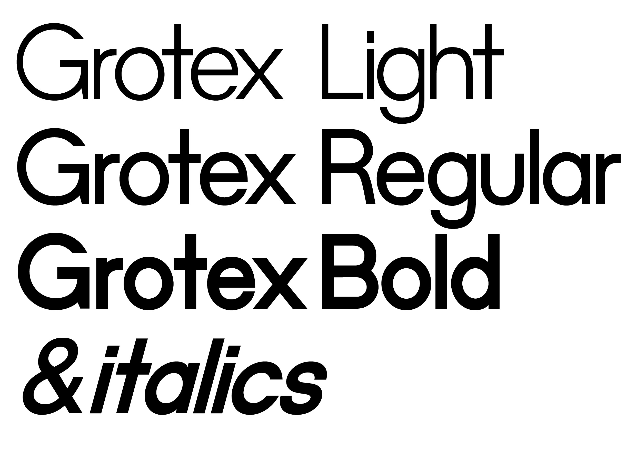
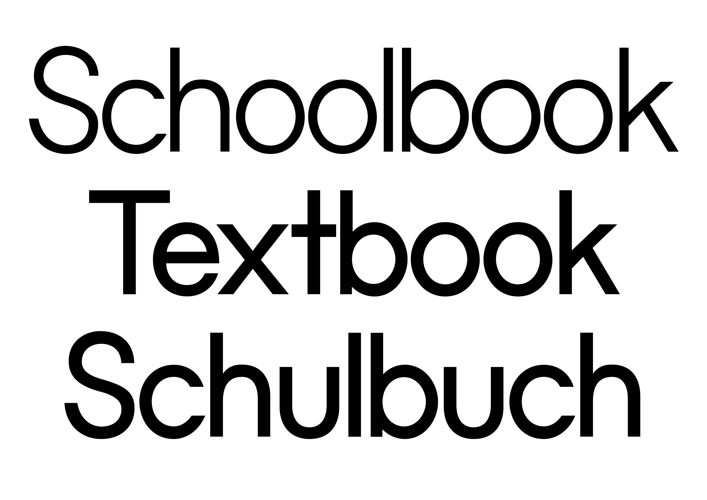
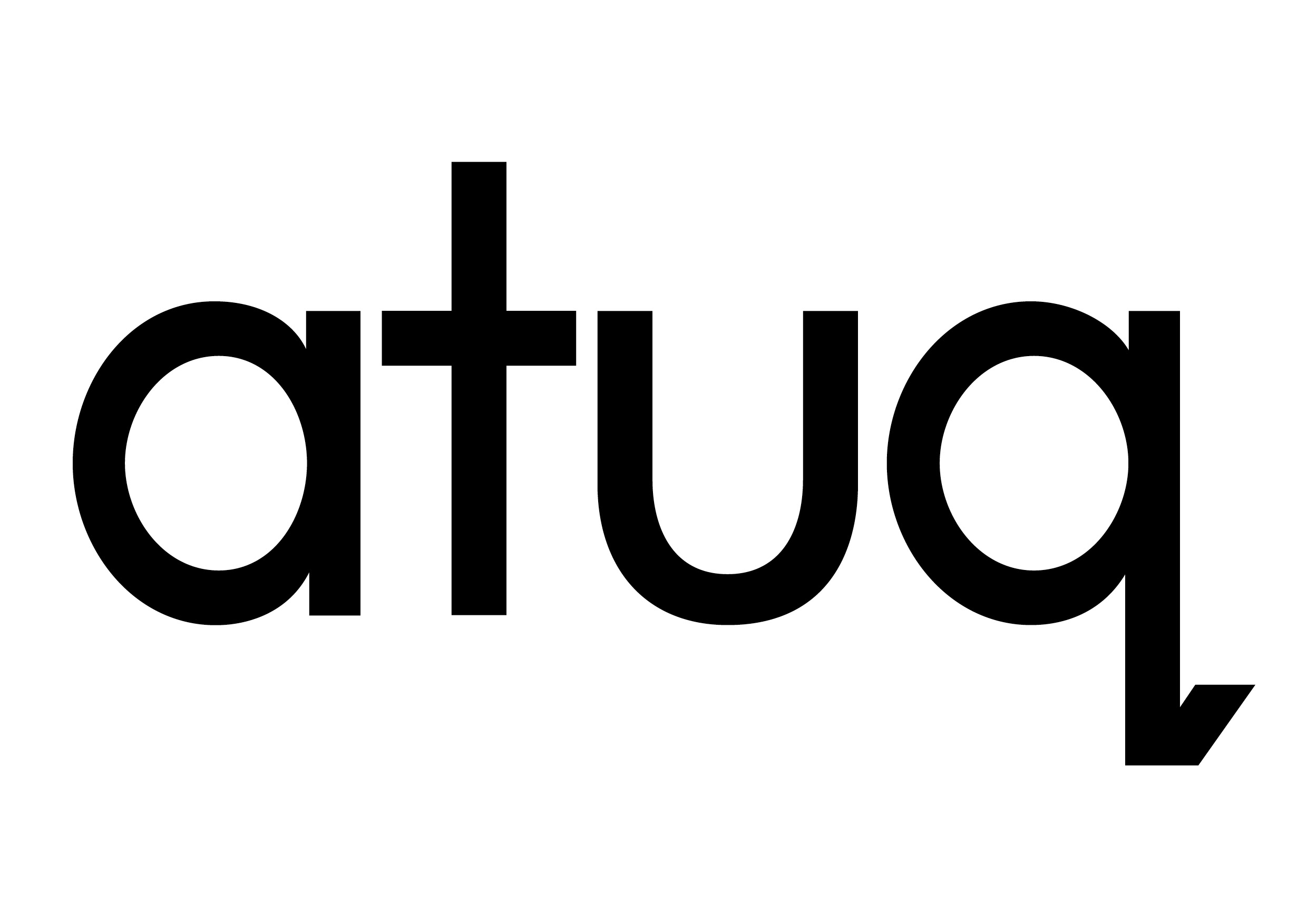
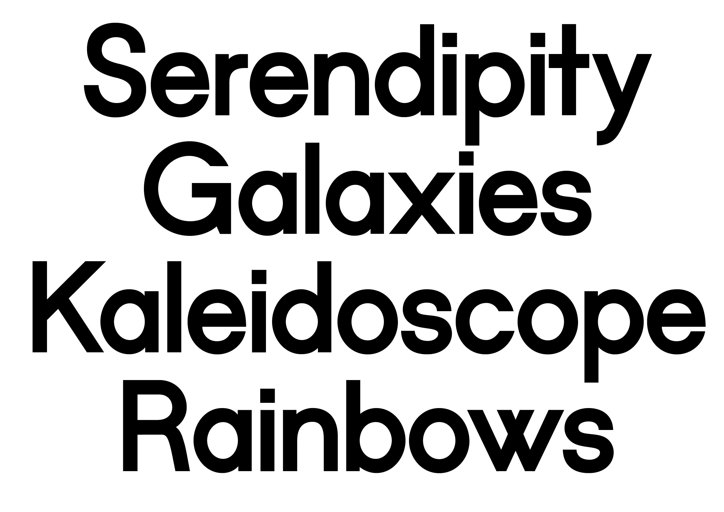
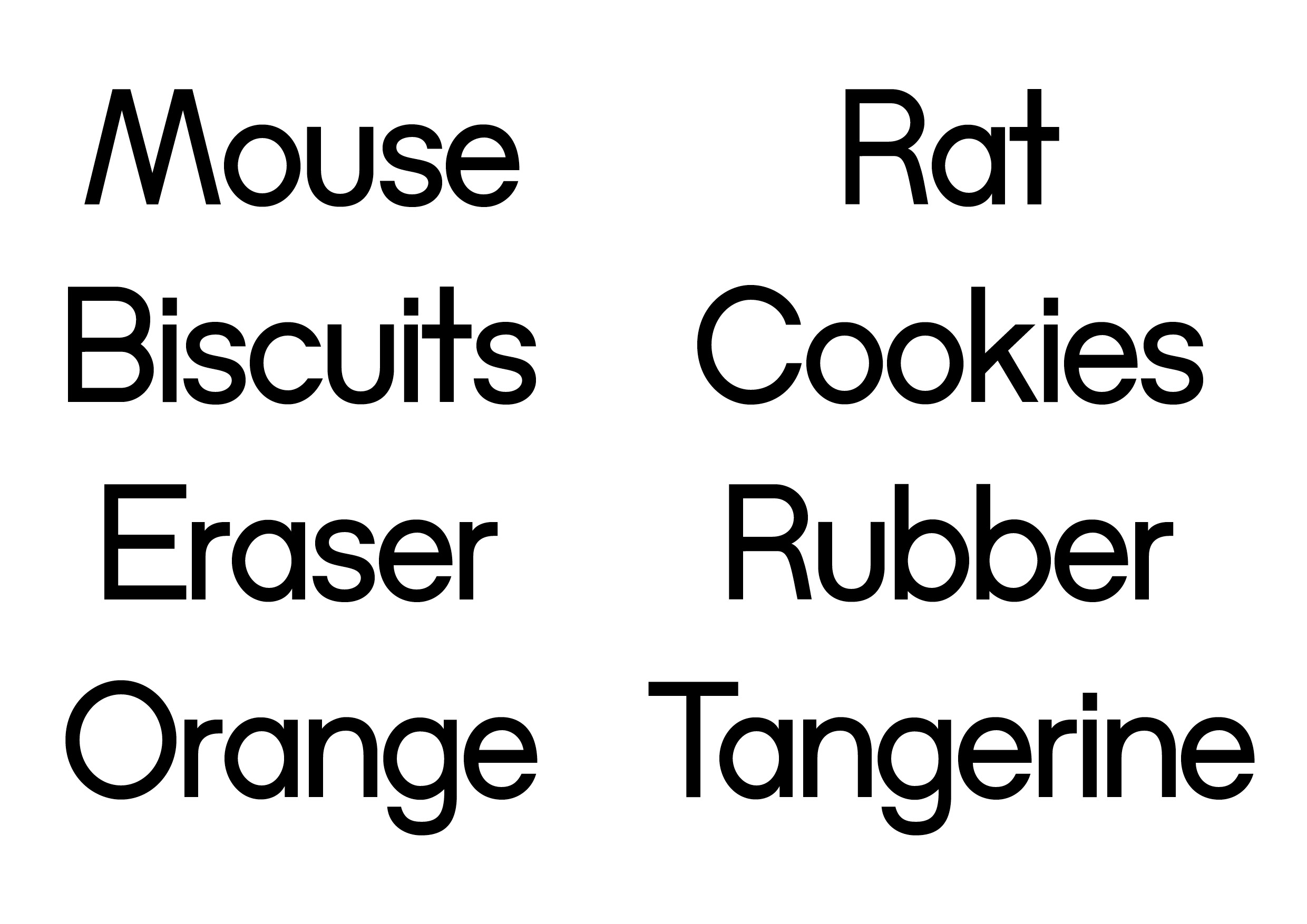
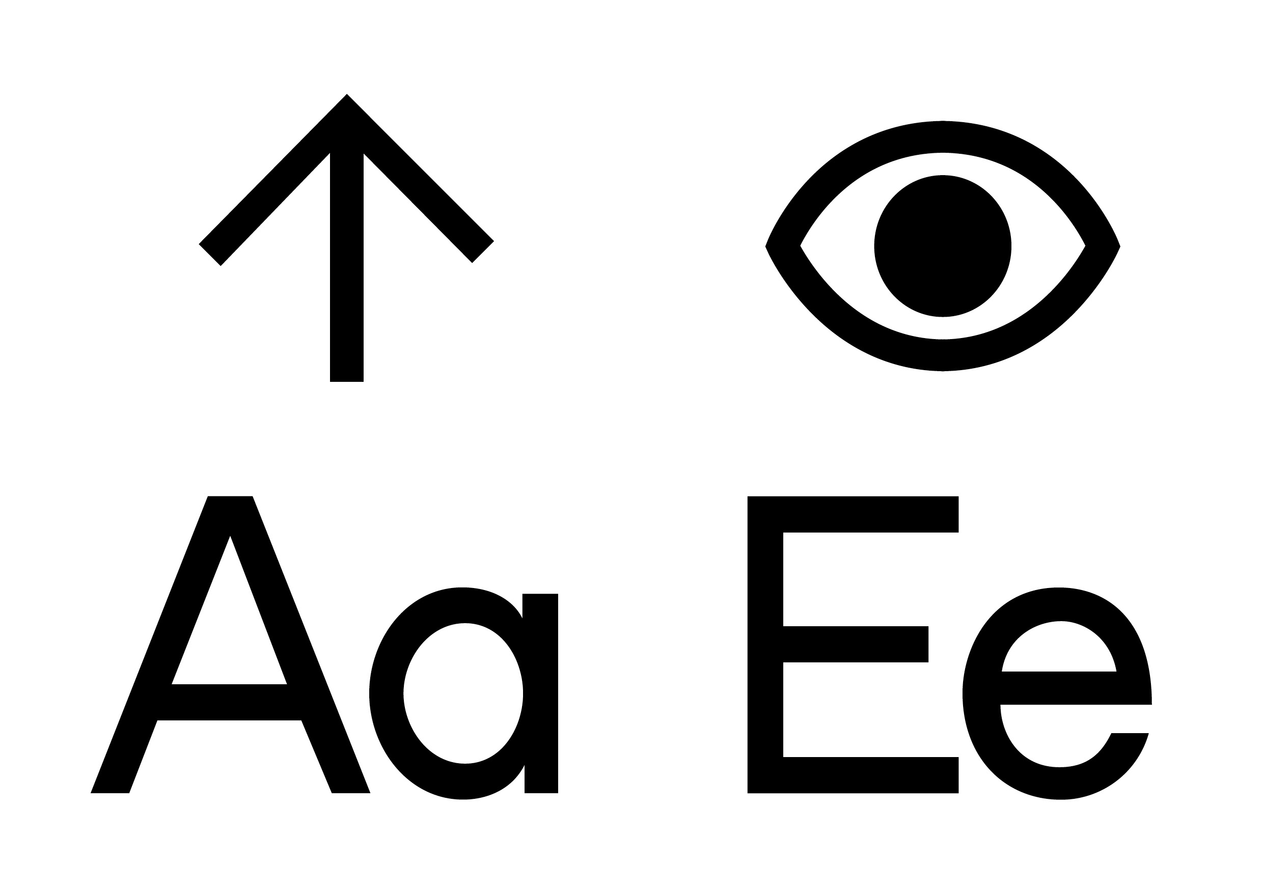
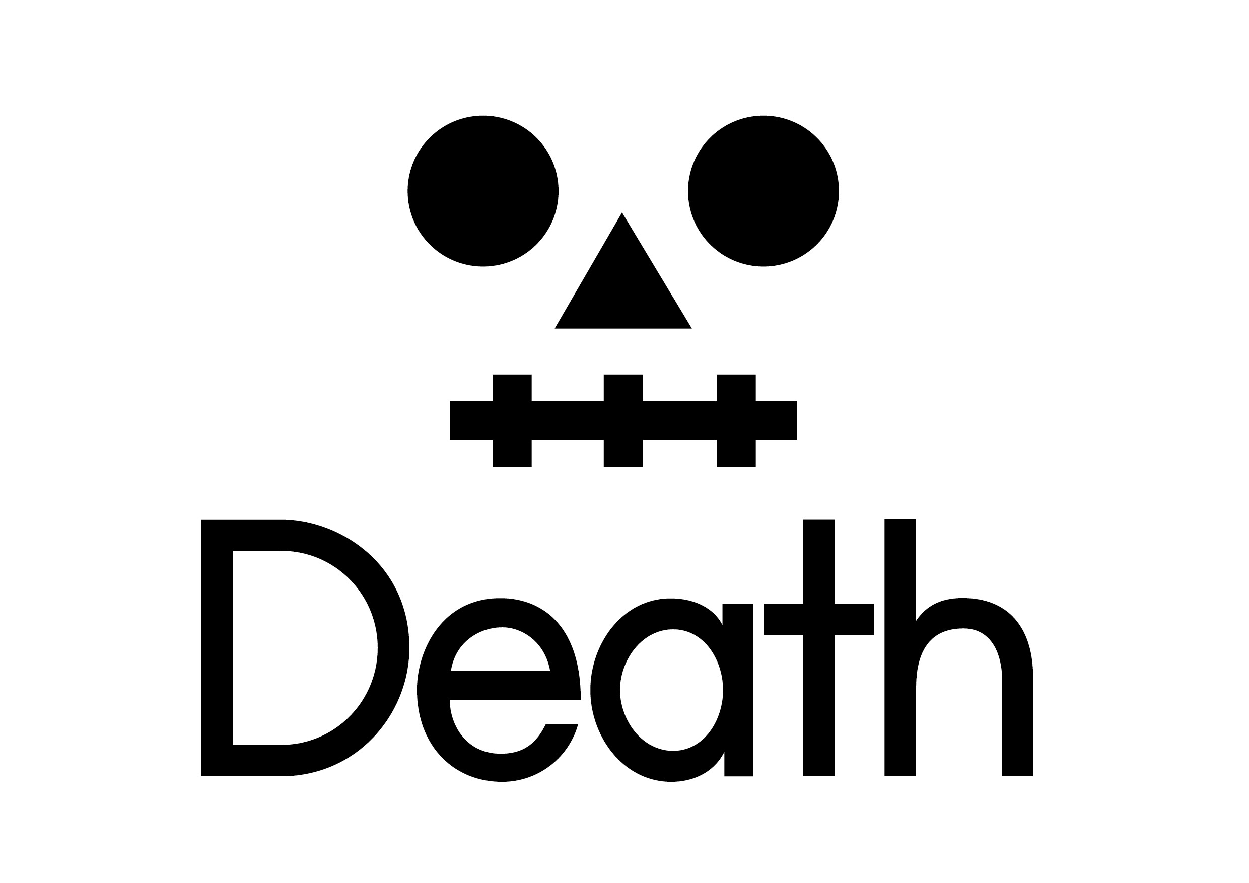
Clean isn't always the most interesting answer. Grotex starts with the familiar language of the grotesk. Simple shapes. Direct construction. Nothing that needs much explanation. What makes it interesting is what happens inside that familiarity. The letters have enough personality to stop the typeface from disappearing into the background. It can be straightforward when it needs to be and much louder when given space. That's what makes Grotex useful. You get something familiar enough to work almost anywhere without ending up with something that looks like everything else.
CATEGORY
Sans Serif
DESIGNED BY
trulytype
RELEASE DATE
2013
VERSION
1.0.1
STYLES
3 styles
ITALICS
None
FILE FORMAT
OTF, WOFF2
LANGUAGE SUPPORT
English, Spanish, French, Portuguese, Indonesian, Swahili, Malay, Italian, Romanian, Hungarian, Czech, Slovak, Swedish, Norwegian Bokmål, Norwegian Nynorsk, Danish, Finnish, Icelandic, Catalan, Galician, Basque, Irish, Welsh, Scottish Gaelic, Slovenian, Estonian, Latvian, Lithuanian, Albanian, Maltese, Afrikaans, Somali, Wolof, Northern Sotho, Southern Sotho, Luo, Filipino, Javanese, Cebuano, Sundanese, Kurdish, Turkmen, Maori, Kalaallisut, Faroese, Luxembourgish, Walloon, Romansh, Sardinian, Corsican, Friulian, Occitan, Cornish, Manx, Kabuverdianu, Jola-Fonyi, Ido, Interlingua, Lojban
— Typography Standard®
View technical report
83%
Legible
96%
Glyph coverage
87%
Readability
80%
Distinct glyphs
96%
Technical integrity
94%
Layout
92%
Files
100%
Licensing

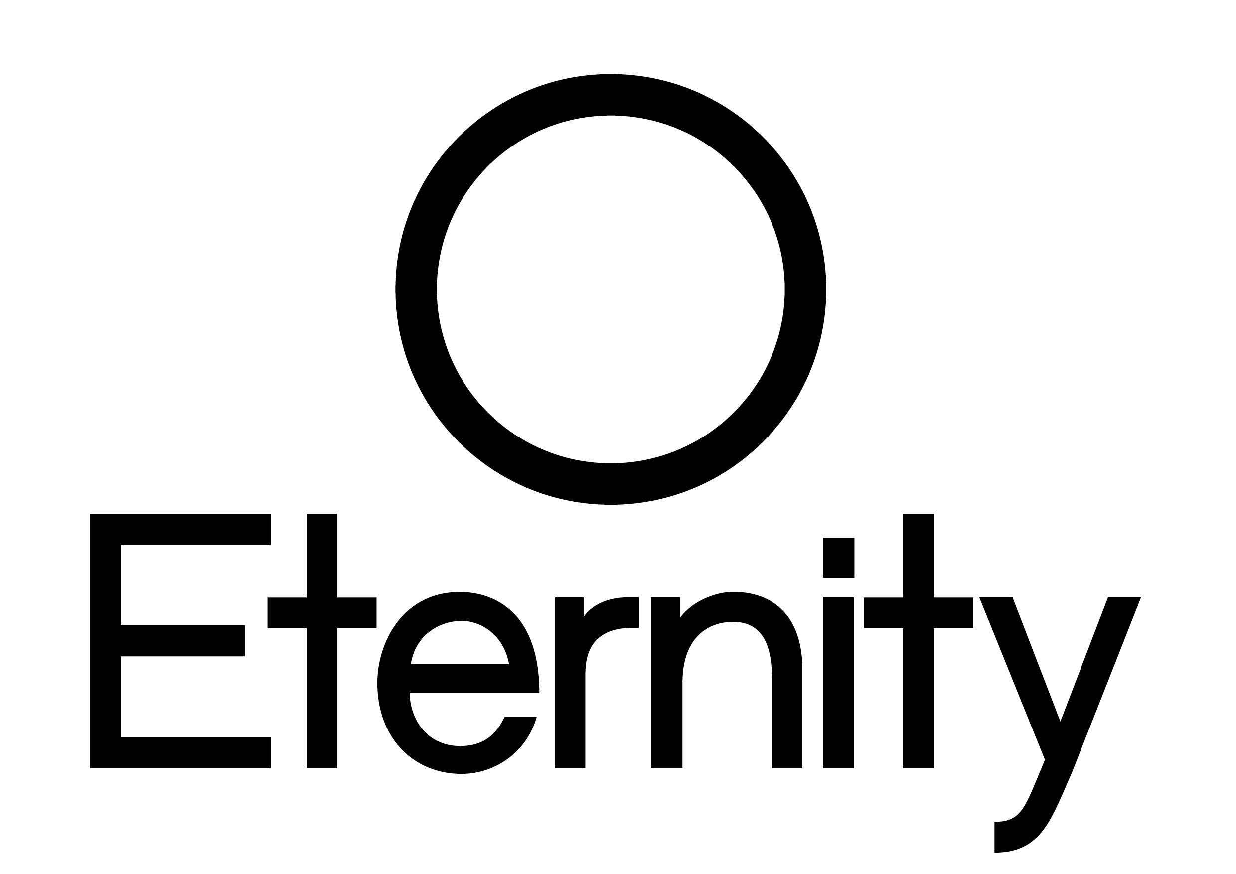
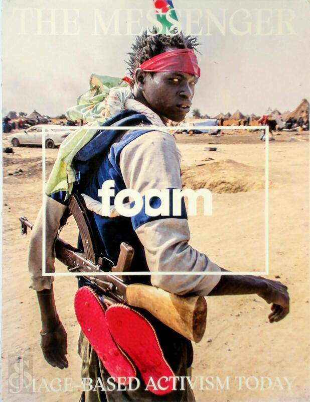
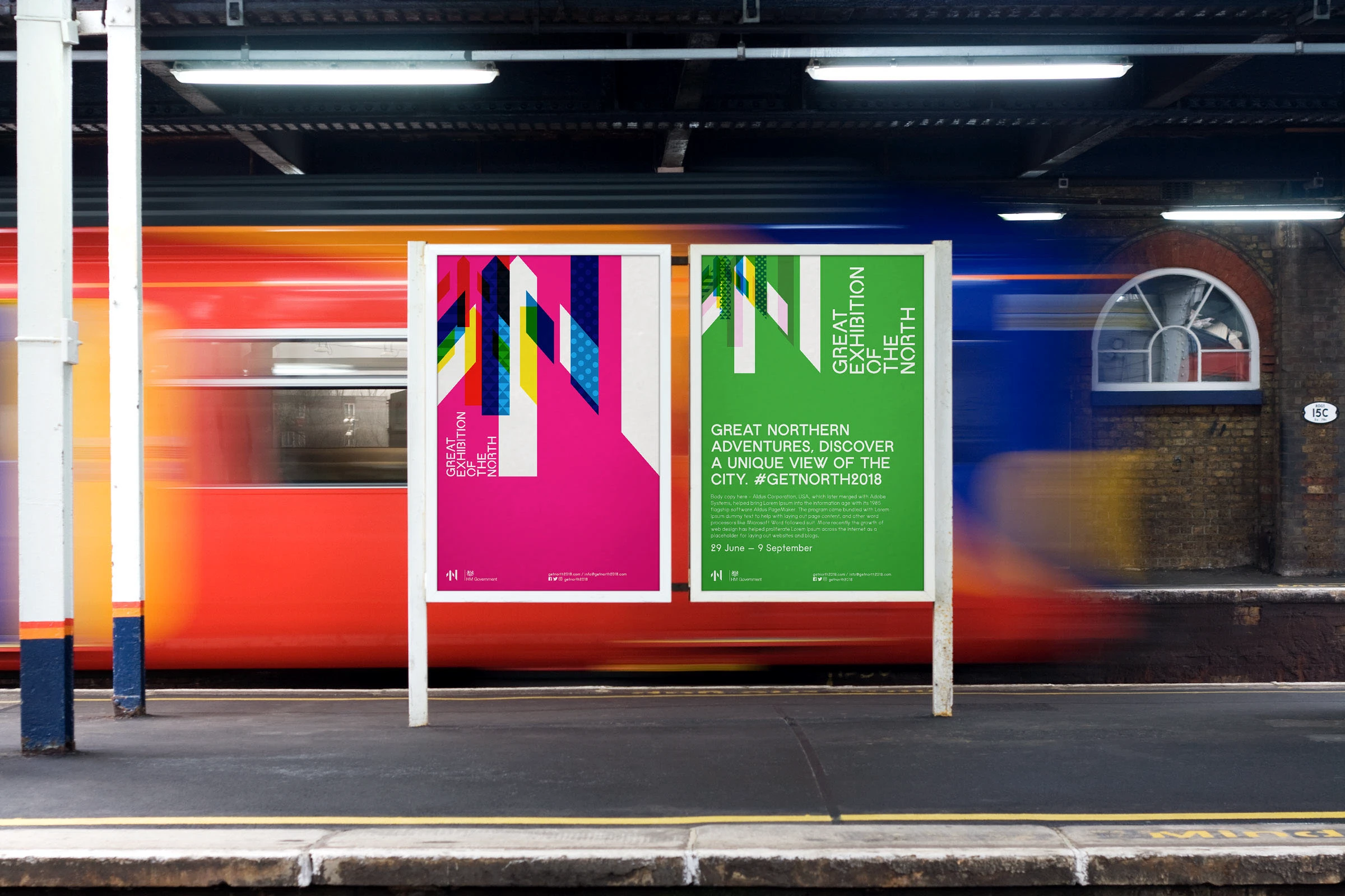
Grotex in the world

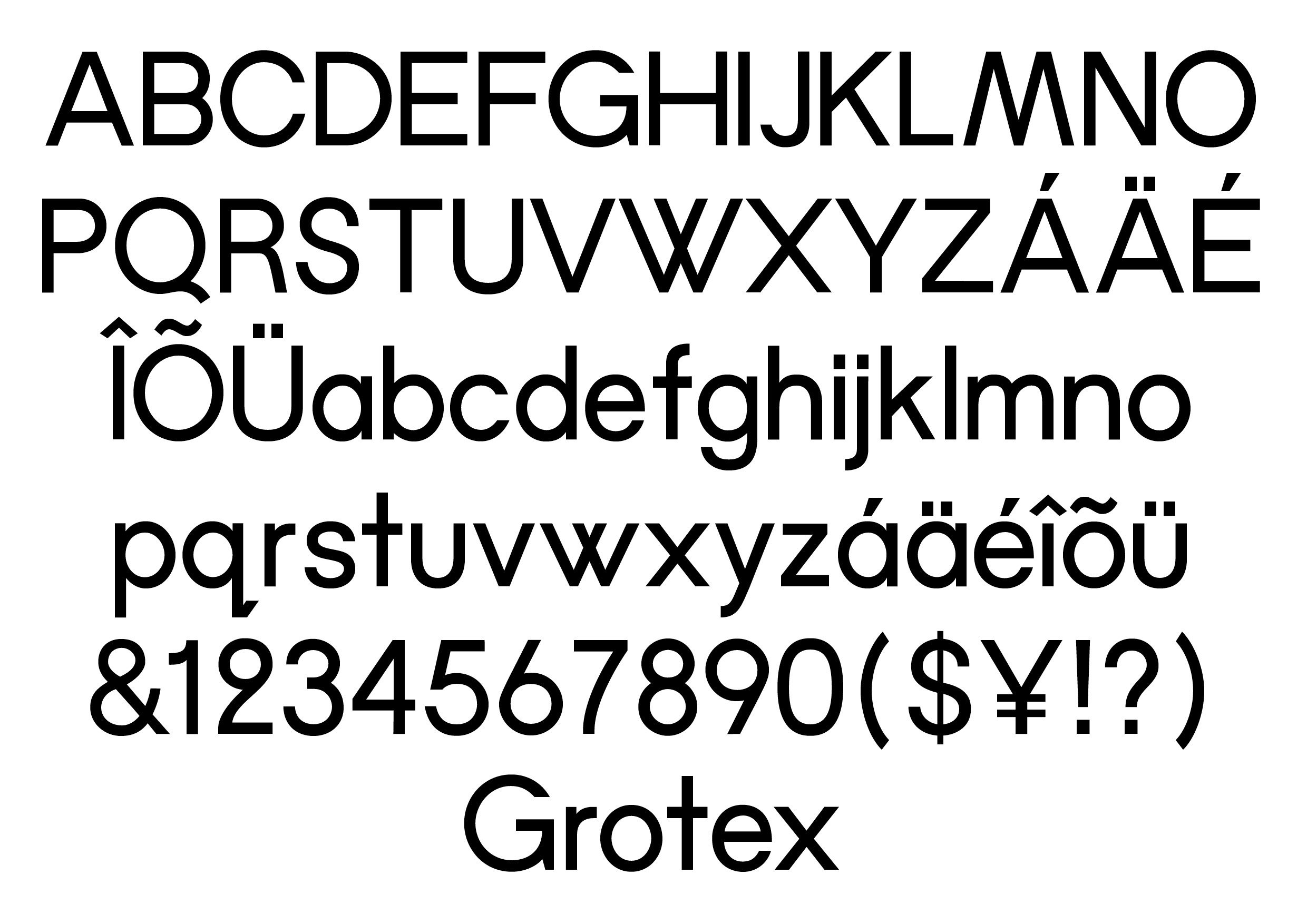
Available Glyphs
Uppercase
A
B
C
D
E
F
G
H
I
J
K
L
M
N
O
P
Q
R
S
T
U
V
W
X
Y
Z
Lowercase
a
b
c
d
e
f
g
h
i
j
k
l
m
n
o
p
q
r
s
t
u
v
w
x
y
z
Numerals
0
1
2
3
4
5
6
7
8
9
Latin Extension
À
Á
Â
Ã
Ä
Å
Æ
Ç
È
É
Ê
Ë
Ì
Í
Î
Ï
Ð
Ñ
Ò
Ó
Ô
Õ
Ö
Ø
Ù
Ú
Û
Ü
Ý
Þ
à
á
â
ã
ä
å
æ
ç
è
é
ê
ë
ì
í
î
ï
ð
ñ
ò
ó
ô
õ
ö
ø
ù
ú
û
ü
ý
þ
ÿ
Ā
ā
Ă
ă
Ą
ą
Ć
ć
Ċ
ċ
Č
č
Ď
ď
Đ
Ē
ē
Ė
ė
Ę
ę
Ě
ě
Ğ
ğ
Ġ
ġ
Ģ
ģ
Ħ
ħ
Ī
ī
Į
į
İ
ı
Ķ
ķ
Ĺ
ĺ
Ļ
ļ
Ľ
ľ
Ń
ń
Ņ
ņ
Ň
ň
Ŋ
ŋ
Ō
ō
Ő
ő
Œ
œ
Ŕ
ŕ
Ŗ
ŗ
Ř
ř
Ś
ś
Ş
ş
Š
š
Ţ
ţ
Ť
ť
Ŧ
ŧ
Ū
ū
Ů
ů
Ű
ű
Ų
ų
Ŵ
ŵ
Ŷ
ŷ
Ÿ
Ź
ź
Ż
ż
Ž
ž
Ș
ș
Ț
ț
Ẁ
ẁ
Ẃ
ẃ
Ẅ
ẅ
Ỳ
ỳ
Punctuation & Symbols
!
"
#
$
%
&
'
(
)
*
+
,
-
.
/
:
;
<
=
?
@
[
]
_
`
{
|
}
¡
¢
£
¥
¦
¨
©
«
®
¯
°
±
´

·
¸
»
¿
×
÷
ˆ
ˇ
˘
˙
˚
˛
˜
˝
–
—
‘
’
‚
“
”
„
•
…
‰
‹
›
™
−