Dooijes
About
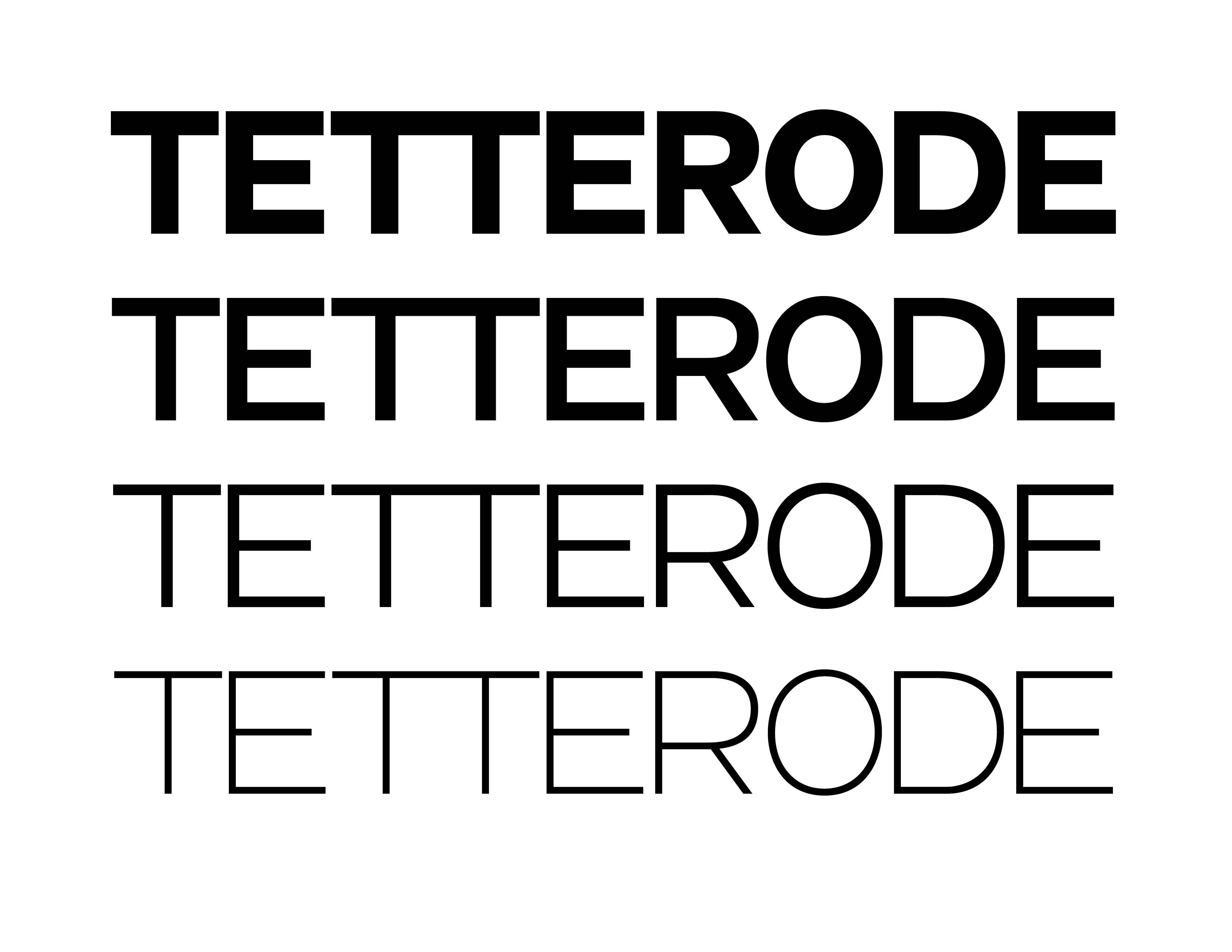
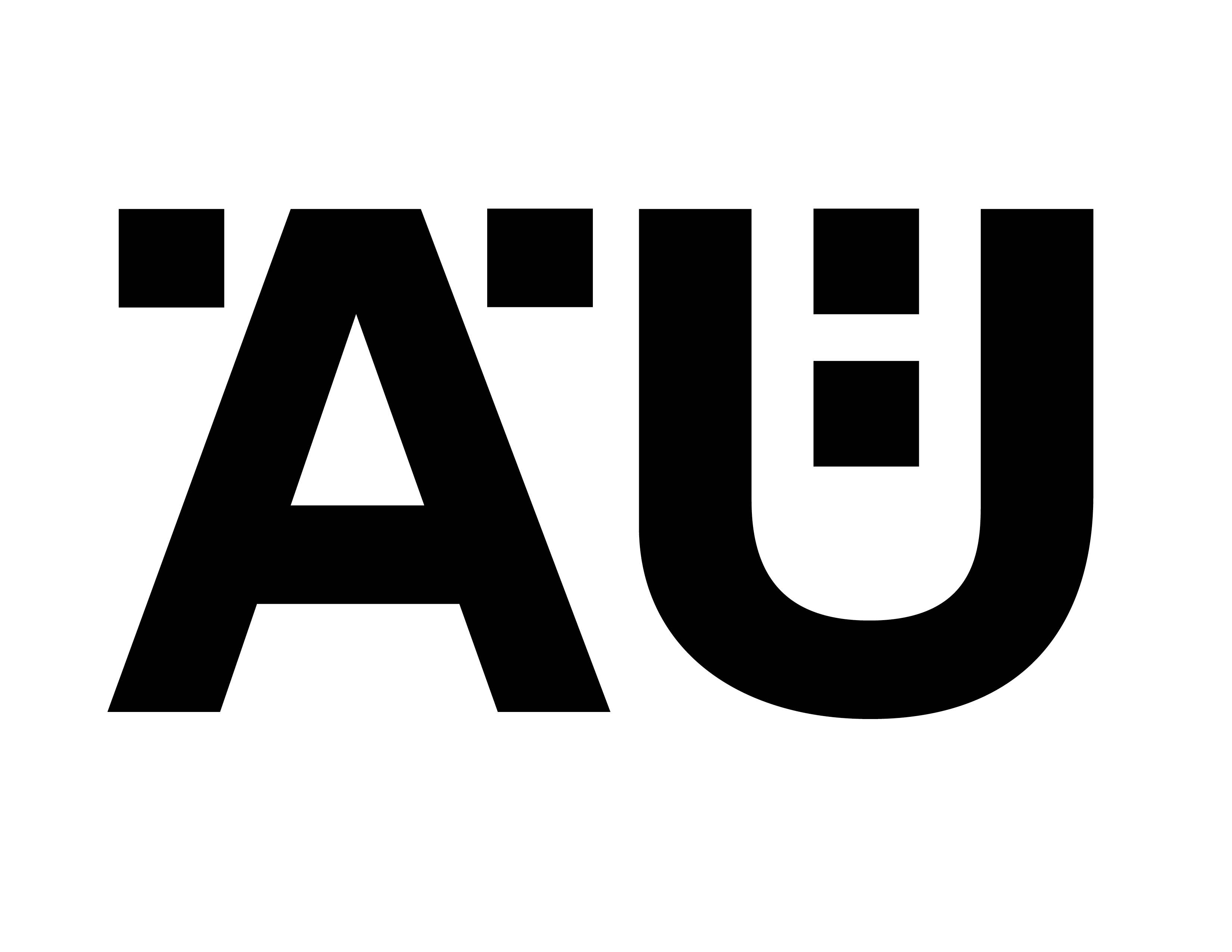
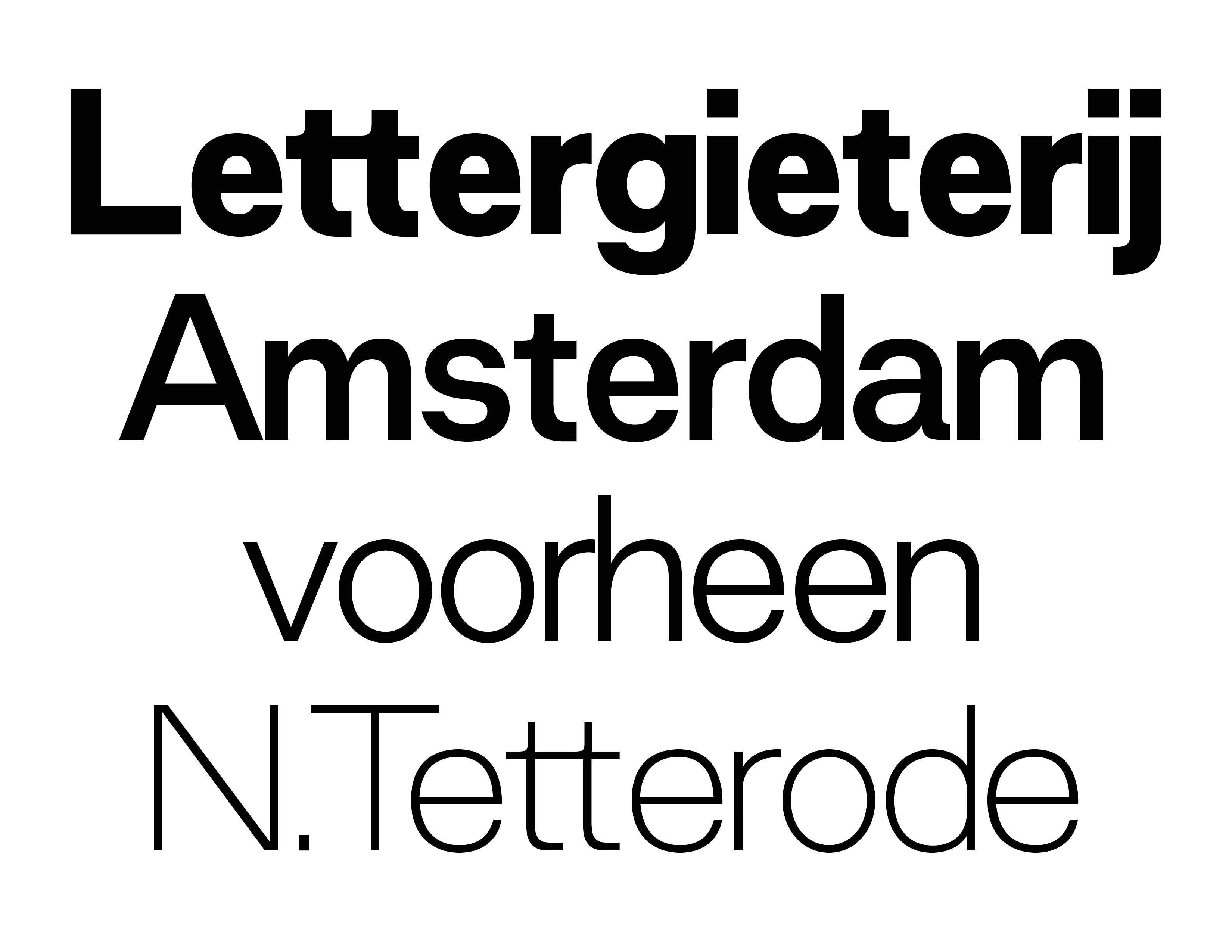
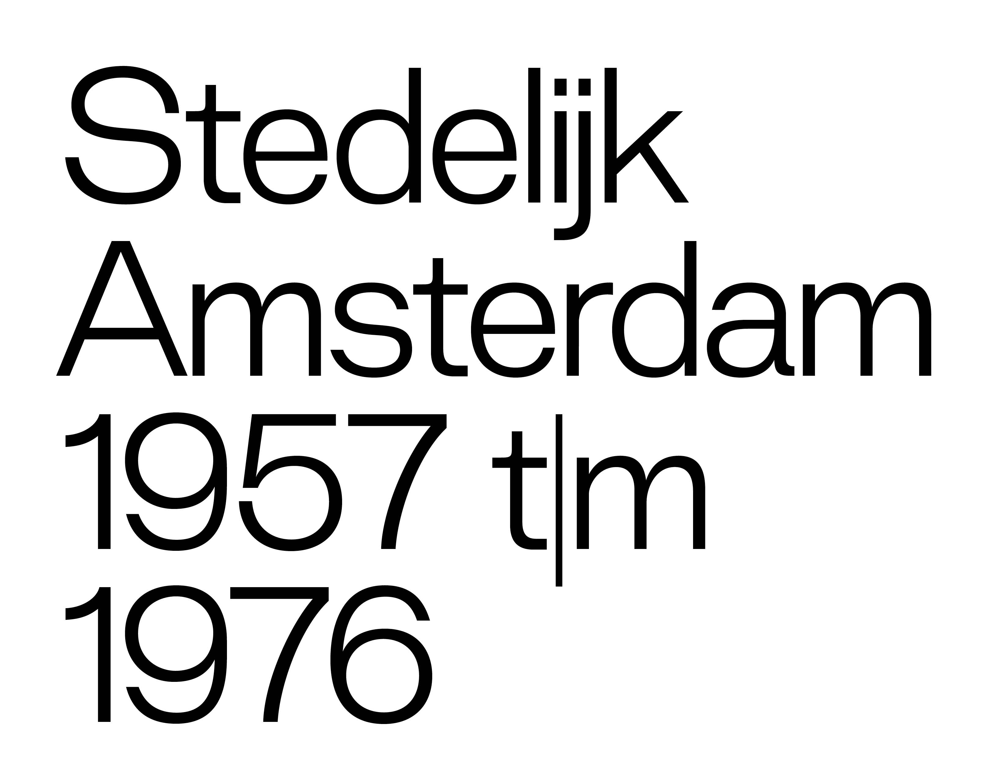
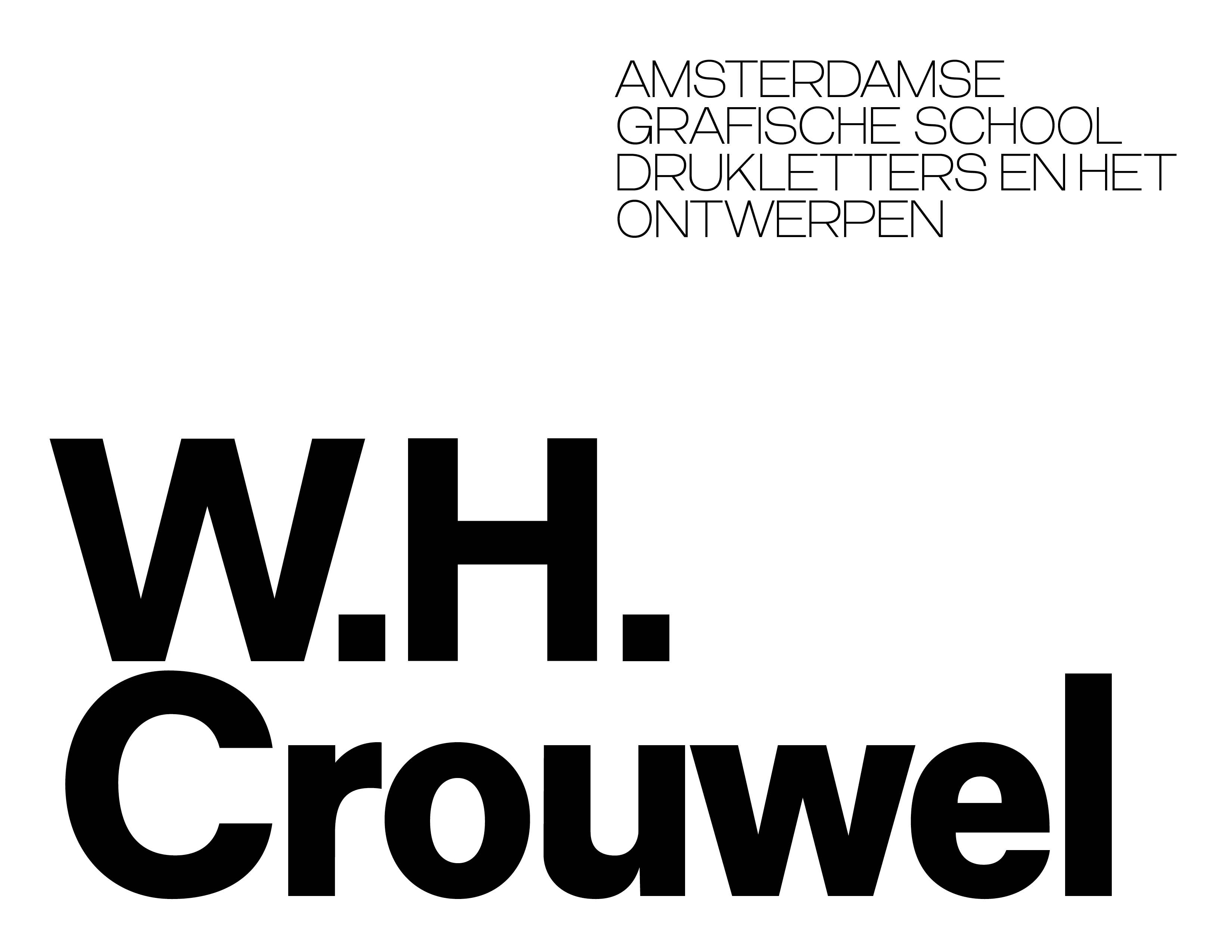
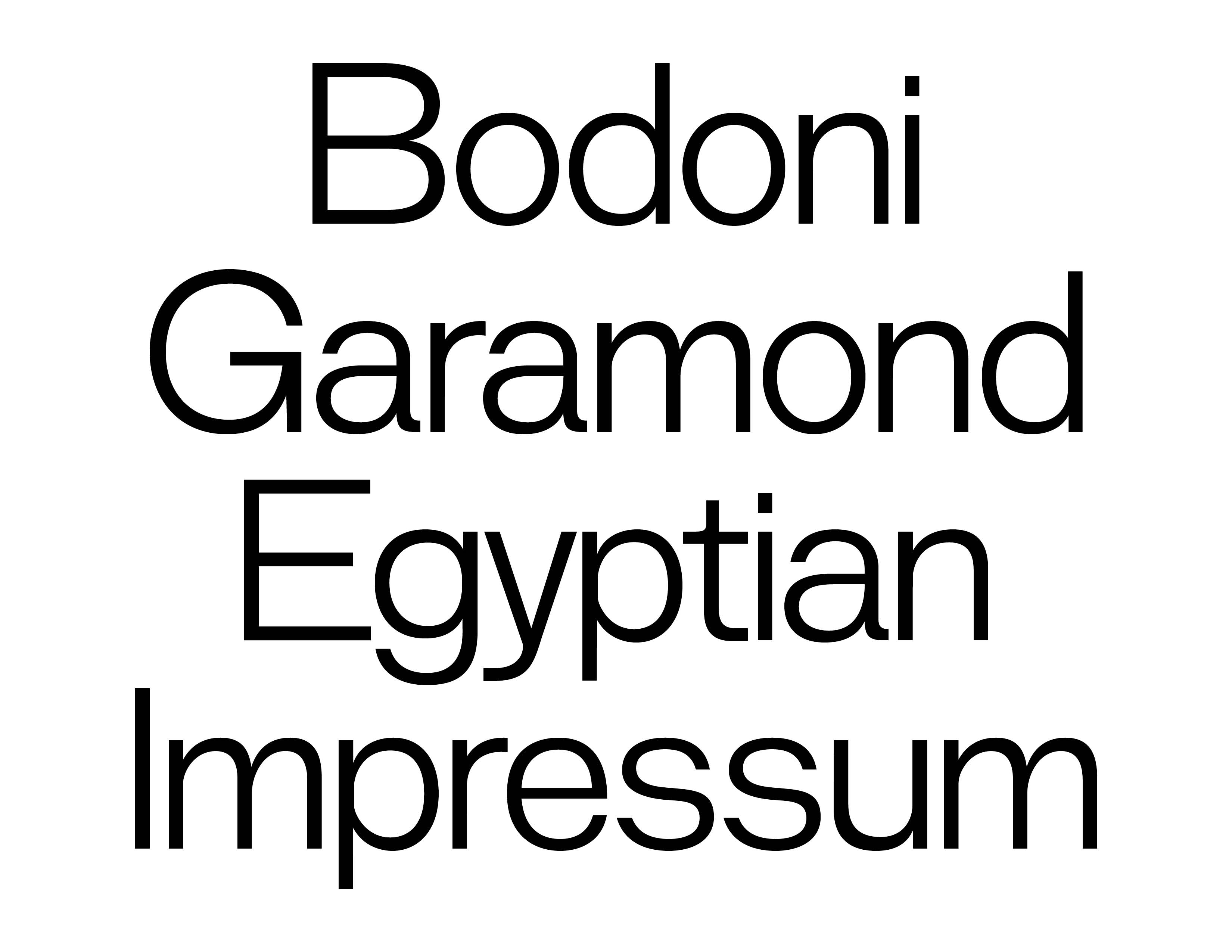
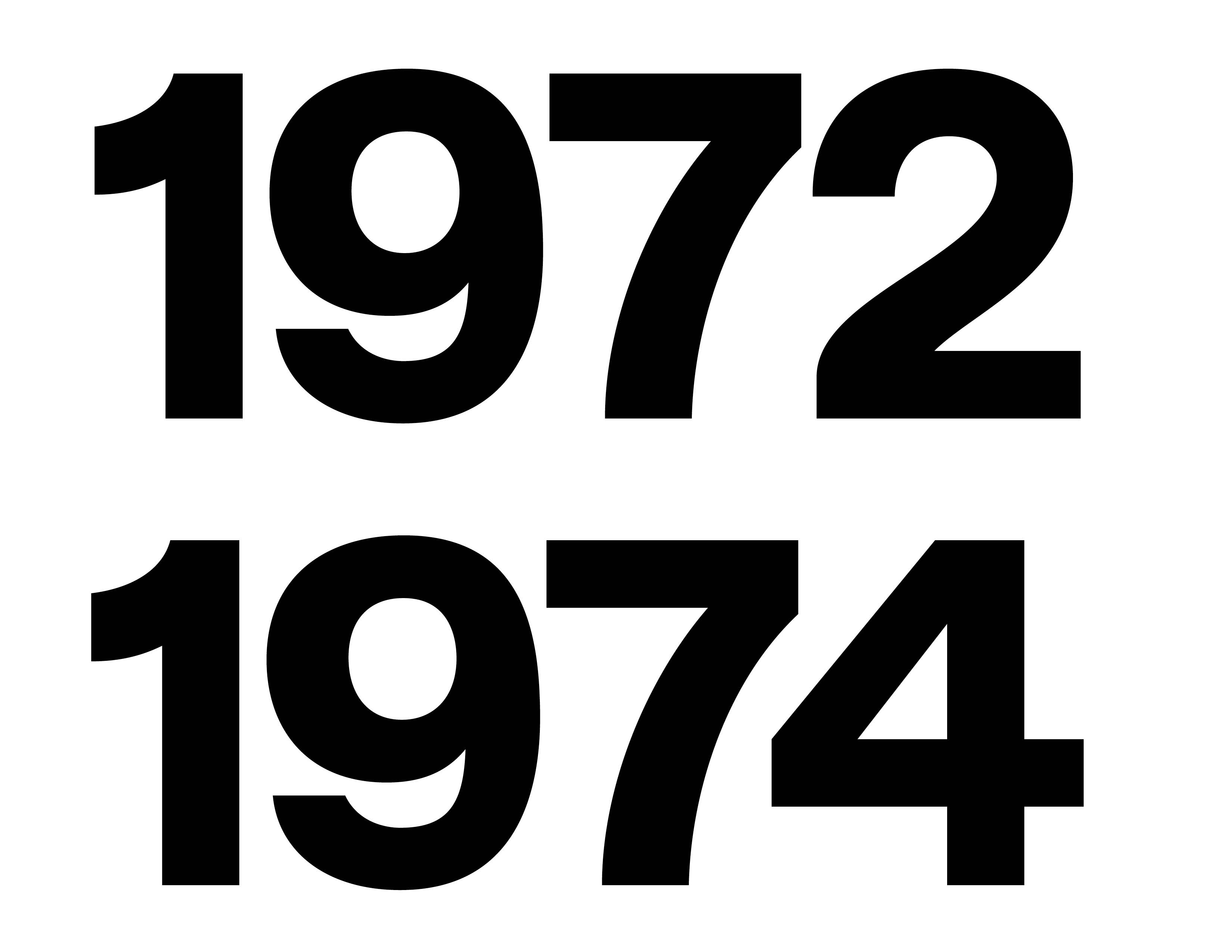
Sometimes the best thing you can do is get out of the way. Dooijes began with Dutch museum catalogues. We loved the way typography could hold together a title and an essay then quietly sit beside a painting without competing with it. That restraint became the starting point. The basic forms are clear and calm but there is another side hiding inside them. A wide set of alternate characters can make the same typeface feel much stranger when you want it to. Dooijes can behave itself for eighty pages and then do something unexpected on the cover. That's exactly why we like it.
CATEGORY
Sans Serif
DESIGNED BY
trulytype
RELEASE DATE
2018
VERSION
1.2.0
STYLES
4 styles
ITALICS
None
FILE FORMAT
OTF, WOFF2
LANGUAGE SUPPORT
English, Indonesian, Swahili, Malay, Northern Sotho, Southern Sotho, Luo, Javanese, Lojban
— Typography Standard®
View technical report
83%
Legible
96%
Glyph coverage
87%
Readability
100%
Technical integrity
94%
Layout
92%
Files
100%
Licensing

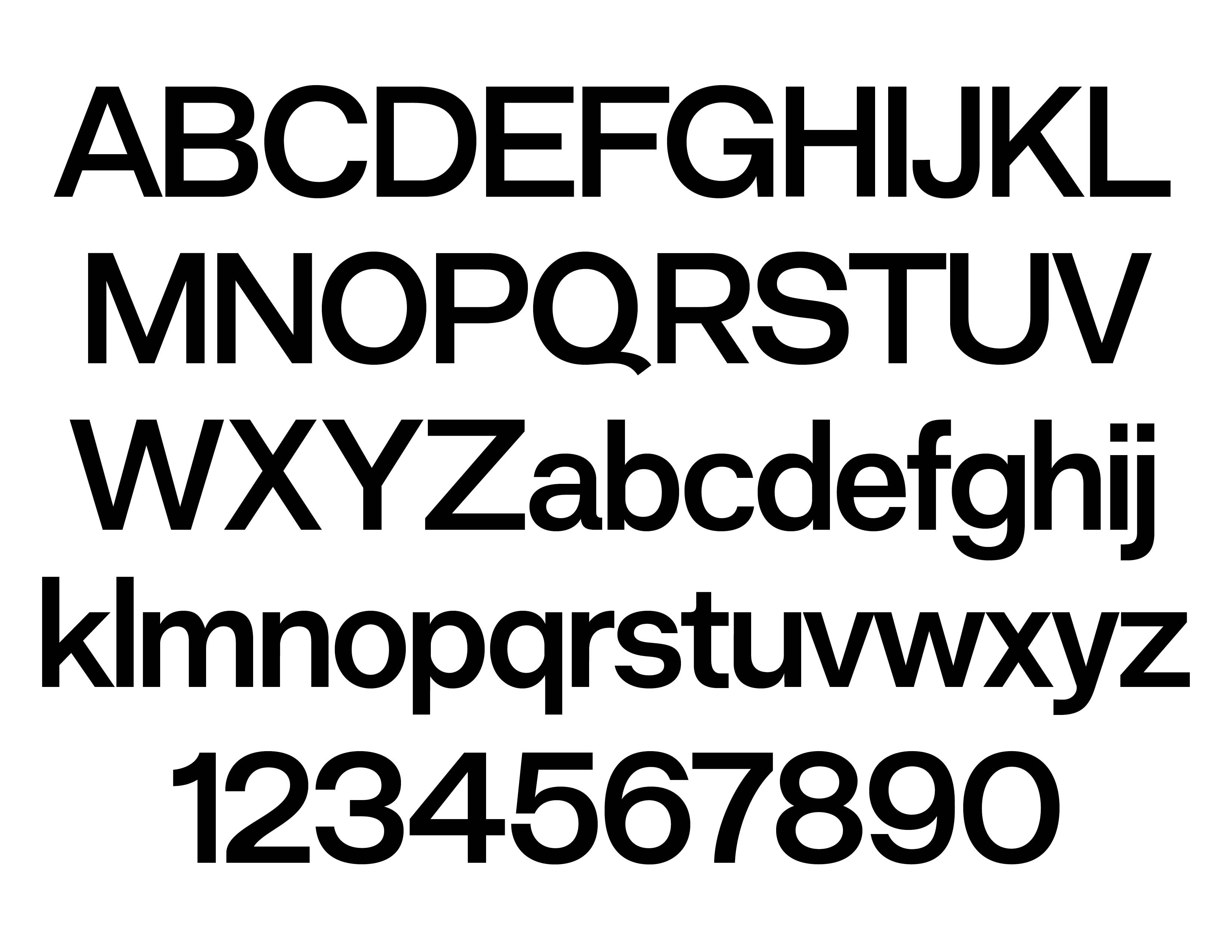
Available Glyphs
Uppercase
A
B
C
D
E
F
G
H
I
J
K
L
M
N
O
P
Q
R
S
T
U
V
W
X
Y
Z
Lowercase
a
b
c
d
e
f
g
h
i
j
k
l
m
n
o
p
q
r
s
t
u
v
w
x
y
z
Numerals
0
1
2
3
4
5
6
7
8
9
Punctuation & Symbols
!
"
#
$
%
&
'
(
)
*
+
,
-
.
/
:
;
<
=
>
?
@
[
]
_
{
|
}
~
¡
¢
£
¤
¥
¦
¨
©
«
¬
®
°
±
´

·
»
¿
×
÷
˚
–
—
‘
’
‚
“
”
„
•
…
‹
›
™
−